A Logo That “Plorks.”
In the 1960s, Corita Kent, the innovative artist and educator, coined a word to describe the convergence of arts and education. She called it “plork.”
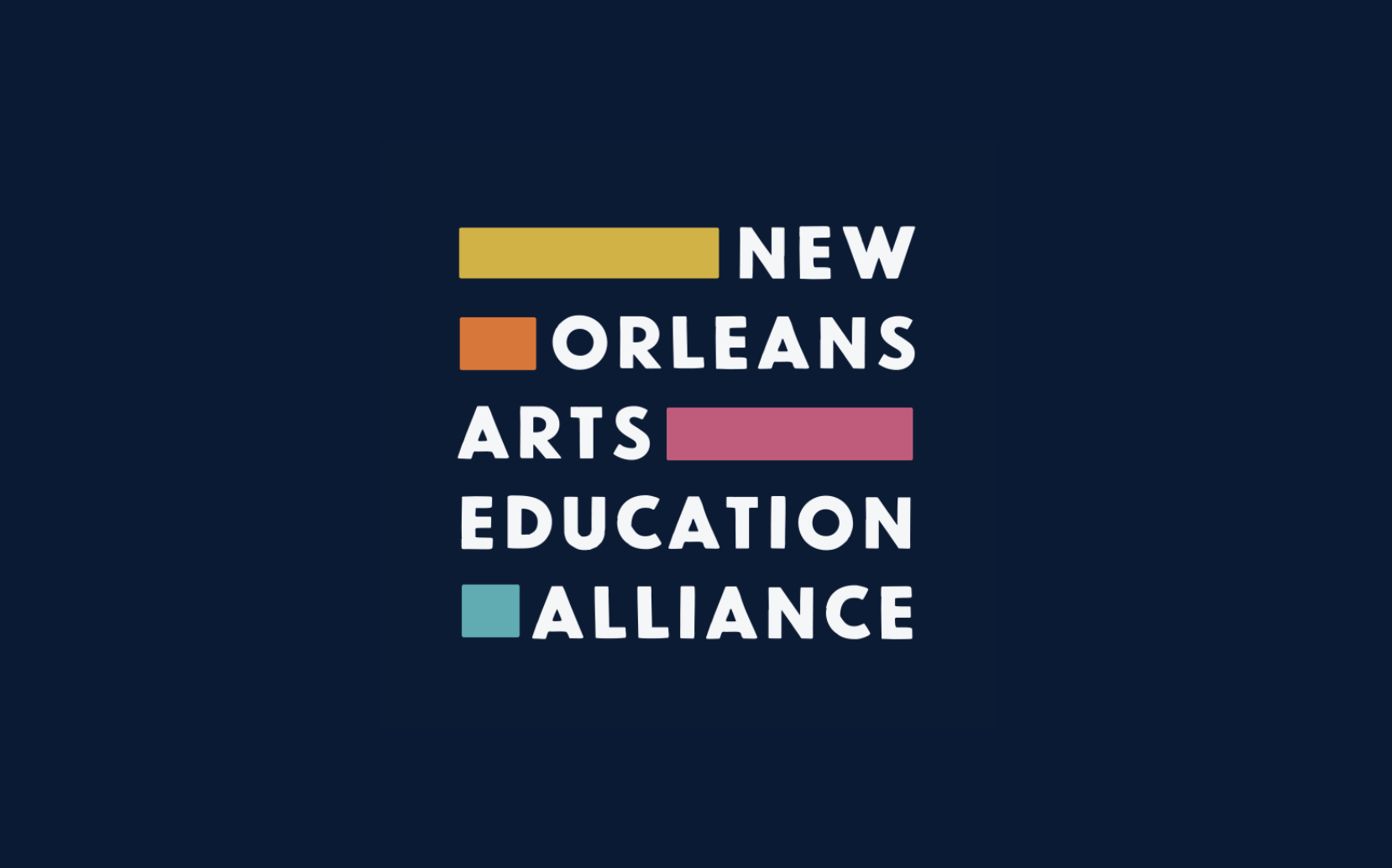
It’s two-fifths play, three-fifths work. When the New Orleans Arts Education Alliance (NOAEA) approached us for their identity design, we knew it had to “plork.” New Orleans is known as a creative city, but the arts have taken a backseat in many of its schools. NOAEA is on a mission to provide all children in New Orleans with an excellent, well-rounded education – which includes training in the arts. And they needed a logo that communicated creativity and education that would appeal to students and teachers alike.
We chose a vibrant color palette to communicate play and used a grid system to communicate education. The color bars are connectors, a visual device for bringing two different ideas together as a metaphor for creativity. The asymmetrical arrangement of type and color results in a logo that feels structured and playful, ordered yet unexpected.